


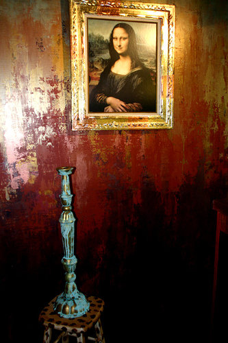
Usually when I pick up the little 'idea' brochures at paint stores, I find the rooms pictured to be sooo contrived and terrible. But while I was waiting for the world's most awesome cabinet paint to be shaken ...I spied this little gem in the Benjamin Moore Envision wall color 2011 brochure. I think that wall finish is really dreamy and fun. I got to thinking about gradient finishes and the fact that I haven't done one in awhile. Several years ago, I had a nifty studio space in a not so nifty neighborhood that served its purposes well but was a gigantic money sieve, so I sold it. In the showroom I created this finish on one wall. People either loved it or hated it. My mother thought it looked like a crime scene. My sister got even more specific and described it as looking like the opening scene from the DaVinci Code.
But I liked it.
 A friend of mine asked me if I could do a gradient finish in her sunroom and I'm hoping that she likes the choppy look. A really fine gradient finish is very difficult to accomplish. I will be including this finish in the class I will be teaching at Designer Finishes Studio in Warrensburg, IL. (date TBA). But I'll give you non professional DIYers a hint.... use a decorator trowel, not a brush. I'm guessing I will need to create a "kinder/ gentler" colorway for the class. I'll probably do a pearl/blue/green/gold kind of thing. Some irridescents are likely to be involved.
Whenever I'm super uninspired and just want to stare at something amazing, I google 'anthropologie store windows'.
I don't live near an Anthropologie and I haven't actually even been inside of one. (My girls have. They enjoyed setting all the egg timers in the kitchen department to go off at different times.) But I've gotten so many awesome ideas from people's photographs of Anthropologie windows and displays, thanks to google images and flickr.
I found this photo and after I was finished smiling at the baloon doggies, I noticed the finish on the walls. It's kind of a sideways gradient. Well it's not exactly gradient because a gradient flows from one color to the next in ROY G BIV order, or flows from dark to light in one color.
So I guess we'd have to call it an ombre look. Ombre means
' shaded' whereas gradient means 'a gradual change in value'.
I had a client a few years back who had a term for the deconstructed look. She called it 'TMIC', which stands for "The Manor is Crumbling". I like my gradients and ombres to have a chunky look that evokes a crumbling manor. Since I like to jokingly call my house my own personal Gray Gardens, it's no wonder I am drawn to this look.A true gradient or ombre should flow more gently, like the fabrics in these dresses.

Ombre dresses via watermelonraindropx.blogspot.com (original source unknown)
No comments:
Post a Comment